Case Study: The Sampersand Brand
After finishing the crucial step of evaluating and identifying the market, I was then able to begin the creative process of cultivating brand identity assets. A logo, typography, and a color palette are just the basic building blocks.

The Process
Icon Ideas
As self-evident as the name "Sampersand" was, the icon seemed just as obvious. The symbol I design to represent my brand should be a clear combination of an S + &. But the question was, S + & = ?
Research
The first step in the development process is always research. I created a Pinterest board and collected over 200 images of ampersands in various styles, and studied the symbol & it's history. I then compared those to classic shapes of the capital S.
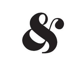
The Sampersand
With more than enough examples to reference, I set out sketching. What would a combination of these two shapes look like? The curves were almost opposite of each other. I had to merge the two icons together to create something new, while still retaining their individuality. During the ideation period, I tried to draw out as many possible combinations, constantly pushing the boundaries of type design.
After the ideation process, I narrowed down my choice to a single solution I thought represented the Sampersand most clearly. It was important to keep in mind that the logo needed to be scaleable, so that it could be clear at both small and large sizes, with the ability to be used in a variety contexts.
With the final shape in mind, I set out to refine it further and create a final vector version in Adobe Illustrator. It was a long, detailed process of editing vector points and bezier curves to find a perfect balance.


The Logo
In addition to a symbol, my logo needed a coordinating wordmark. I did this through a bracket style process of elimination. I typed out "Sampersand" in 80 different fonts, in both standard and capitalized styles.
With the Sampersand symbol almost finalized, I used this as a starting point to compare the different typefaces to. This helped eliminate many styles in the beginning. Later in the process, I compared each typeface's version of the ampersand to my Sampersand in order to ensure cohesion.
Eventually, slowly, and painfully, I came down to two final font choices: Essones and Playfair Display. Stuck between two beautiful choices, I consulted my brand values and saw that Essones communicated them more.
A brand's word mark isn't simply the brand name typed out. It is a unique, proprietary shape. Below is "Sampersand" typed out in Essones, followed by the edited logo version. The letter "S" was made bigger, the ascenders and descenders were extended, and the teardrop terminals were replaced with ball terminals in order to match the Sampersand design.

The final step of the process was to combine the icon and the word mark. In order to be multi-purpose, I needed both a horizontal and vertical version.

The Typography
When I selected Essones to be the typeface for the logo, I knew that didn't mean I had to say good-bye to Playfair Display. My Sampersand brand still needed official typography. Playfair Display would make an excellent header type paired with Avenir Book, my go-to font for body copy.

Color Palette
Deciding on colors was the most challenging aspect of this project At least with the symbol and type, I felt as though I had a starting point. When it came to colors, how could I settle on three, two, or even one color to represent me and my work?
I must have researched and tried dozens of palettes before finalizing the one below. A combination of teal, lilac, gray, black, and white, was a unique and pleasant palette that aligned with my brand values as they manage to be both bright and elegant.

The Future
A logo doesn't exist by itself in a void, it is carefully applied and used in specific contexts with a goal in mind. Whether it's creating brand awareness, or being used to solidify a consistent presence, brand assets are used to create something larger than themselves.


